

(original photo removed.)
this image is photoshopped. i can tell from some of the pixels and from seeing quite a few shops in my time.
That’s correct. I checked with David Photoshop and he confirmed it.
The amount of photoshops has also dramatically increased since 1970s
However the amount of photo shops has dramatically decreased in that same time period.
Hey, does he know John Reader and Jeff Lightroom?
I’ve been told he is good buddies with Bob Gimp.
Ah, a person of culture I see.
shoop da whoop
Now that’s a meme I’ve not heard on a long time.
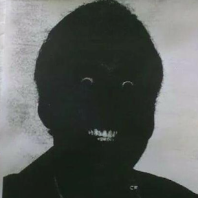
There is something about his face that doesn’t look natural but I’m not quite sure if it’s Photoshop or AI
Its resting DOOM face
I see it too but it’s a little bit blurry on the details
They cut his fingers off. It’s definitely AI.
It’s an old meme, sir, but it checks out.
It’s an older meme, Sir, but it checks out.
A imagem foi feita em photoshop. Posso falar pelos pixels e por que ja vi alguns shops no meu tempo.
Sim, concordo. Me impressiona o quanto a IA consegue economizar tempo na edição de fotos atualmente.
Hey, no wizard languages allowed. You could be casting a spell for all I know!
Hocus Pocus and Ala Kazaam! Musubibreakfast likes to eat ham!
deleted by creator
That “teacher” has interpretation, extrapolation, and interpolation issues.
its just an AI meme anyways
deleted by creator
I lowkey don’t think it looks bad. Clearly I have just as little fashion sense as he does.
It’s like people forgot Photoshop exists
That does happen often, but this is an AI image, not photoshop
I’ll bite. How is it AI?
The biggest giveaways are the weirdly pixelated faces (used to hide obvious AI elements) the awkward pose, the way the plaid pattern on the left side (his right arm, just before the white sleeve) merges together, the lack of any other version of this image existing (which is common for photo shopped images) and that when this is run through AI detection software it is flagged as such.
I don’t think this image is AI because of the background composition. While I agree the pattern on the right arm looks a little weird, that alone doesn’t proof it’s AI. It could be edited using AI but might just be photoshopped. Also you shouldn’t trust AI detection software, it doesn’t work.
Thats why its only one of a few reasons and not the only reason
AI just isn’t capable of doing faces. if it were, you’d see faces.
I bet he thinks ice cream is correlated with the violent crime too

Violent crime precedes ice cream consumption. Clearly crime makes people hungry for ice cream.
You scream, I scream?
While I do not disagree with you, we shouldn’t underestimate the consumption of stolen ice cream which increases both.
Not ice crime!
I always violent crime before I ice cream
Due to the cost of icecream these days you may have to do some violent crime to pay for the icecream
I like the Nic Cage movies and drowning deaths correlation more. Lol
clearly it is, thank you for the heads up
ice crime
Teaching students to not conflate correlation with causation by pointing out absurd assumptions of causality from real correlations.
My favourite argument is that; The amount of people buying ice creams and the amount of people drowning also looks like curves that follow each other. But less ices creams will not make less people drown. They both go up because of good weather conditions. They do not influence each other.
The historical version of this was the ww2 airplane patch job stats, where american bombers returning after getting hit were hit in specific areas and the statistician had to explain that those who returned despite that damage meant those were not the places to reinforce but the other areas of the plane makeing it more survivable, or more recently how Santa Monica CA almost removed crosswalks because that was where the highest pedestrian mortally rates were. In both those cases the people making the assumptions missed the bigger picture, for the planes that those who got hit in more sensitive spots got downed and for pedestrians getting killed at crosswalks that was because that is where pedestrians cross the street most of the time, almost leading to more deaths.
I do believe murders also positively correlate with ice cream sales.
I remember asking my first stats teacher. Something like
“So sometimes it’s obvious that there is a 3rd reason why two things are strongly correlated so we know it’s absurd to assume that one causes the other. But what about when it’s not so easy to tell?. When many people believe one does cause the other. ? (Even in scientific literature). How do we know for sure what is actually causal related and what just looks related?”.
Short answer. More research. And if possible. Controlled experiment using the sciencetific method. Not always possible.
–
She then went on to explain the research on video game violence and behavior violence in kids who play such games.
This is where things get complicated.
Violent kids (behavioral traits) seem to be encouraged to be more physically violent by engaging with violent games/media.
But kids who aren’t already aggressive or violent don’t get that effect.
Kids with violent tendencies are more attracted to violent video games and play them more.
Many behavior and social problems are like this.
One type of engagement increases a specific type of behavior that further increases the engagement that perpetuates the behavior.
Things become cycles.
For instance. Depression and anxiety may encourage people to self medicate with recreational drugs. Recreational drugs have long term effects, many of which are increases in anxiety and depression. Which then encourages the person even more to seek out drugs to cope.
Studying phenomena in the world that can’t be investigated with controlled lab experiments is actually very complex and they often have to gather a lot more data and use more sophisticated statistics.
Probably trying to make a point that correlation and causation are not always related.
Yep. The image is fake, but the graph by itself is an excellent example that correlation does not equal causation.
The fuckig disrespect to barely blur this man’s face and post him in a photoshopped t-shirt that makes him look like a piece of shit.
What the fuck is wrong with you? What did this man do to you that you would post this online? You think that blur job is doing anything?
“Relax, it’s just a joke”
PEOPLES LIVES HAVE BEEN RUINED FOR THIS KIND OF SHIT! All it takes is one dumbfuck to not see that it’s a joke to cause a problem. One parent who complains to the admin who grill this guy for no reason. One shithead student who starts a rumor about him.
Fuck you OP. I hope someone plasters YOUR shitty blurred face all over the internet and tries to tie YOU to being a racist, elitist, piece of shit.
The only thing I can say is that I didn’t think through what I was doing. That’s not an excuse though.
As soon as I came back here and say your comment something in my head snapped and what you were saying made complete sense. I immediately erased it and will make every attempt to think through posts that may be problematic in the future before I post them.
Totally my fault.
:(
Dude I’m sitting here trying to figure out what the hell this Windows background has to do with anything
The image was an obvious fake and this is shitpost community. It wasn’t that bad. It wasn’t very funny but it also wasn’t inappropriate.
It’s alright, people make mistakes and such. Thanks for being reasonable about it.
Six hours later i can very clearly see the dude’s face
deleted by creator
Best correlation/causation explation:
I’m a bit stoned, so that might play a factor but… I’ve just sat there staring at those statistics and graphs in awe for a solid 10 minutes. Thanks for this!
Why the fuck did they add an AI slop explanation and image to each graph lol
To clarify, you get the slop if you click “View details about correlation #NNNN”
It’s the Correlation vs Causation T-shirt.
I mean… clearly hes wearing a white shirt with ai or photoshop on top of it.
No, those lines to straight and flush because that man is so buff and doesn’t move his torso. At. All. Ever heard of Iron board abs? That’s this guy. Keeping his shirt logos flush since 1977
only 7 years to save for a house? well maybe i guess if you don’t have major emergencies. i’m going to go laugh madly in the corner now.
No, it’s not about fiat currency, it’s about the changes to the economy caused by the rise of MBAs and business executives who had different ideas about the way business should use profits (stock buybacks and hiring bureaucrats rather than raises and expansion) and what a company should do (make money rather than provide goods and services at a profit). Read some Graeber to understand more. All this was part of the beginnings of neoliberalism which is the actual problem here, and the end of countries following Keynesian economic policies. And in the US the weakening of unions and the new deal also played a role.
Well at least that’s the case for the economic graphs there. Things like single motherhood and higher divorce rates stem from feminism winning the right to no fault divorce and the ability for a single mother to be less trapped into a relationship she doesn’t want. Several of these graphs stem from social changes in the late 20th century.
There were a lot of economic issues under metallic currency including somewhat frequent panics and crashes.
Well it’s a good thing we fixed the frequent panics and crashes. That would be dangerous.
I believe the correct answer to OPs question is "an object lesson in the difference between correlation and causality.
Or proof he doesn’t understand that difference, whichever applies.
A shirt that screams that correlation =/= causation.
It’s a round about way of expressing that correlation does not imply causation. It was done so that everytime someone shares this meme of a guy wearing a T-shirt over his flannel, someone in the audience can explain that the graphs intentionally represent a fallacy.
This needs a Hide The Pain Harold faceswap.
Even though you could argue the graphs are right, that still does not mean the variables are related in some way.
Line go up 📈 But also sometimes line go down 📉
I can’t debate it
Gonna need to call in the master at debatin.
There’s nothing to debate—it’s just an example of correlation.


